User-Center UI Design
Filmicca, a movies-focused streaming platform, has commissioned a redesign to provide a more contemporary and visually appealing interface for users.
The design underwent a simplification process to enhance visual appeal and user experience. By adopting an organic aesthetic and harmonious composition, visual clutter was reduced, resulting in a smoother, more engaging experience. This modernisation preserved the core structure while elevating its overall appeal.
Challenges
Upgrade the app's design to a more modern and contemporary style, ensuring all current components and information remain accessible.
Prioritise scalability in the design to ensure the app can be adapted to smaller devices without compromising the user experience.
Carefully incorporate new components like Cast and Info playlist, progress bars, and a vertical navigation bar to enhance the app's features without disrupting the user experience.
Goals
Maintain a consistent visual style that aligns with the app's brand identity.
Enhance the visual appeal of large images to provide a more cinematic and engaging experience, aligning with the app's focus on movies and series.
Prioritize a clean and uncluttered interface to enhance visual appeal and improve user satisfaction.
Homepage
For the new hero carousel, I've decided to focus on a single thumbnail. To enhance engagement, I've replaced the traditional poster with a scene from the movie…
Implementation of a vertical layout for the playlists and removal the titles, since they're redundant given their inclusion in the thumbnails. This vertical arrangement maximises space, allowing for more movies to be displayed.
The current navigation bar lacks visual appeal and could benefit from a more modern and engaging design aesthetic.
The reposition of the navigation bar to a vertical orientation, has greatly enhanced readability, whilst the introduction of Iconography has improved navigation efficiency significantly
A brief description and a call-to-action button encourages and engages users to interact
A scroll indicator has been added to the hero carousel to visually cue users that they can explore additional content by scrolling
Visually distinct icon design aims to enhance user engagement by providing clear visual cues
I've retained the familiar layout structure but added visual interest by rounding the corners and using actual movie stills instead of generic images. In this case, I've utilized a frame from an animation movie available on the app
Single Content
The previous layout illustrates a weak visual hierarchy within the overall page design
The content detail page now features a prominent image that occupies the majority of the screen, effectively capturing user attention
The icons have been reduced in size but remain visually prominent. This allows users to focus more on the content and encourages interaction with the play button. Additionally, all buttons now feature a more modern and visually appealing design
To enhance visual interest, I've swapped the generic series poster for a more engaging scene from the show. I've also removed the Filmicca logo to create more space for the background image.
I've redesigned the episode list to be displayed horizontally, allowing users to easily scroll through all episodes. To make the list more visually appealing, I've replaced the thumbnails with scenes from the corresponding episodes.
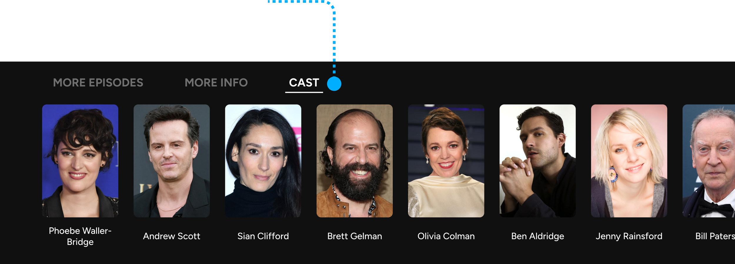
The 'cast' button will provide users with access to a comprehensive list of the movie's cast members
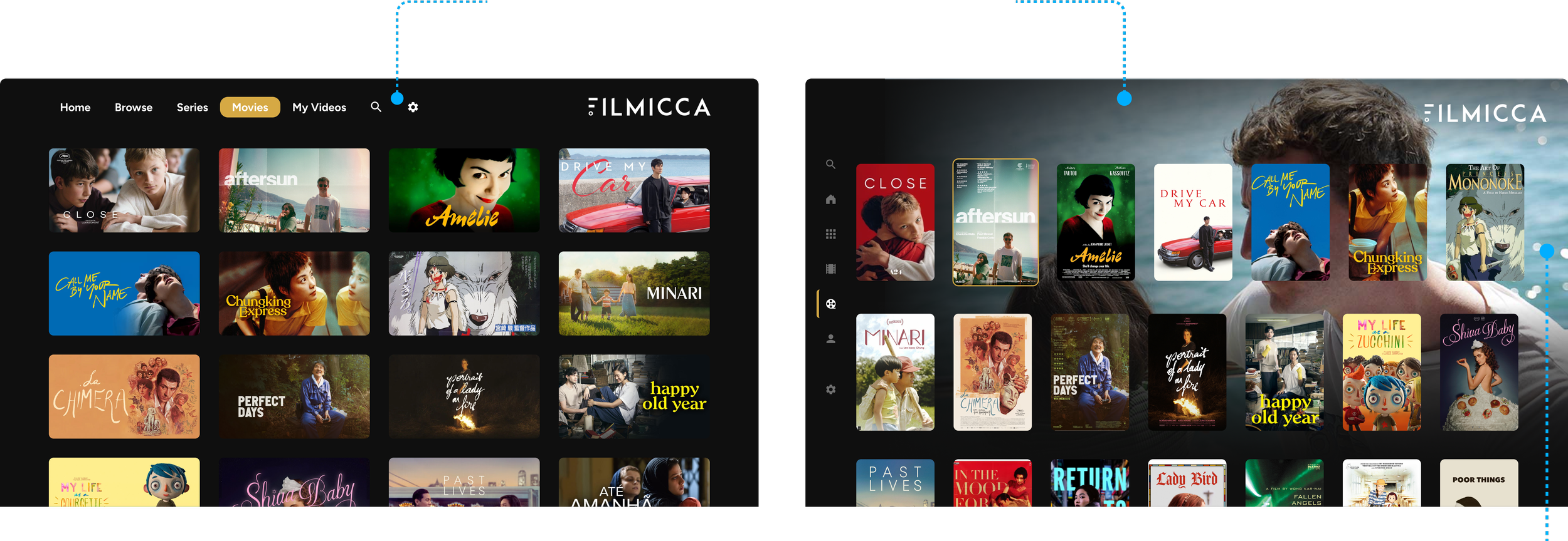
Given the significance of movies on Filmicca, I aimed to enhance the visual appeal of the movies page without drastically altering the layout. I've implemented a vertical playlist format for the movie section, reminiscent of the movie posters displayed in theaters
The background of the page will dynamically change to display a scene from the movie that the user is currently hovering over.
Final Thoughts
Ensure the design is visually appealing and intuitive, considering current UX best practices.
Adjusting component sizes can be more effective than overwhelming users with excessive visual information
Strategically incorporate useful components, such as progress bars, to enhance user engagement and provide valuable information.


